Minimal setup for tabs
This page introduces you to the minimal setup for tabs. It's important to understand how this example works because it teaches you the theory behind tabs. Understanding this helps you to build any kind of tabs you want. Here is our example:
There are two terms being used: tabs are the elements that you click and panes are containers for your content that are associated with tabs.
HTML code
You can use any HTML element for tabs and for panes. This tool is not dependent on any specific element. However it is important to keep your HTML as simple as possible and stick to the standards. Here is the HTML layout for the tabs in this demo.
<!-- the tabs -->
<ul class="tabs">
	<li><a href="#">Tab 1</a></li>
	<li><a href="#">Tab 2</a></li>
	<li><a href="#">Tab 3</a></li>
</ul>

<!-- tab "panes" -->
<div class="panes">
	<div>First tab content. Tab contents are called "panes"</div>
	<div>Second tab content</div>
	<div>Third tab content</div>
</div>
JavaScript code
The role of JavaScript is to "bind tabs to panes" and enable the tabbing effect. Here is the code being used in this demo
// perform JavaScript after the document is scriptable.
$(function() {
    // setup ul.tabs to work as tabs for each div directly under div.panes
    $("ul.tabs").tabs("div.panes > div");
});
First you must select the root element for tabs with a jQuery selector. All direct children under the root work as tabs. Then you supply another jQuery selector as the first argument to the tabs constructor which selects the panes being used. This time you don't select the root element - you select all the panes directly instead. This is because you don't necessarily have a usable parent element for your panes.
After this JavaScript one-liner everything is pure CSS coding.
CSS Code
CSS coding is the most work when making tabs. This example uses the following stylesheet for tabs. The workings of the stylesheet is commented in the file. This stylesheet is not "minimal" because we wanted to use nice looking tabs on the first demo.
There are hundreds of different tab designs on the net and it's up to you what your own tabs will look like. You you can either design them from scratch or steal designs from the net or you can use our tabs as a template. These tabs are implemented using the "CSS Sprite" technique. We use a single background image that you can see here.
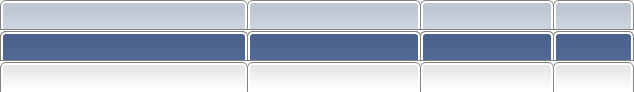
You can see that it contains different width alternatives. You can adjust an individual tab's width by assigning different class names for on individual tab: from narrowest to widest s, l and xl, respectively. This technique is very good when you want to use images in your tab design and at the same time have customized mouseover and selected states.